A Healthier Body - A Guide to Optimizing Transactional Emails
With some simple improvements, make the messages you send from your application more engaging and your users more successful!
In a previous article, we discussed how taking simple steps to improve subject lines can dramatically improve the clarity, effectiveness, and open rates of your transactional emails.
We're taking a deeper dive into optimizing the content included in an informational email. In this article, the focus is on the content (or email body). Here we go!
Yes, we get lots of email. Spending our already divided time trying to decipher the important details from the fluff can be truly maddening. You know what it feels like -- so when you are crafting emails for your users, keep that pain in mind. It'll help you optimize your message and make you users more likely to succeed.
In our subject lines article, we used an email I received from a local university regarding an Engineering Day my child was registered for. Let's stay with that theme and see what steps we can take to improve the email that I received.
Here's the original email (I pasted what I received into Enveloop & modified to remove personal info):
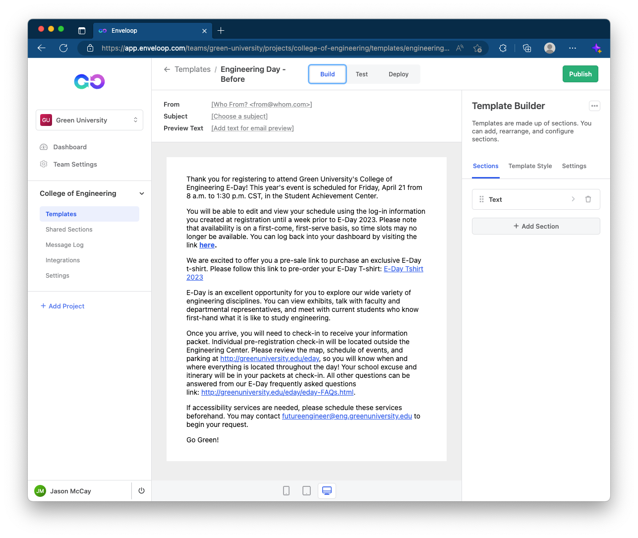
A basic transactional email -- but, loaded with important information. As you likely agree, the email is difficult to scan. Let's talk about some simple improvements we can make.
Tip #1: Headers Establish Visual Organization
Give your users a visual map of the content you need them to consume.
Outside of a couple of paragraph breaks, the earlier example email is just a blob of information. It forces the user to do a ton of extra work, deducing and mentally organizing/prioritizing the content being presented, instead of simply reading the critical parts.
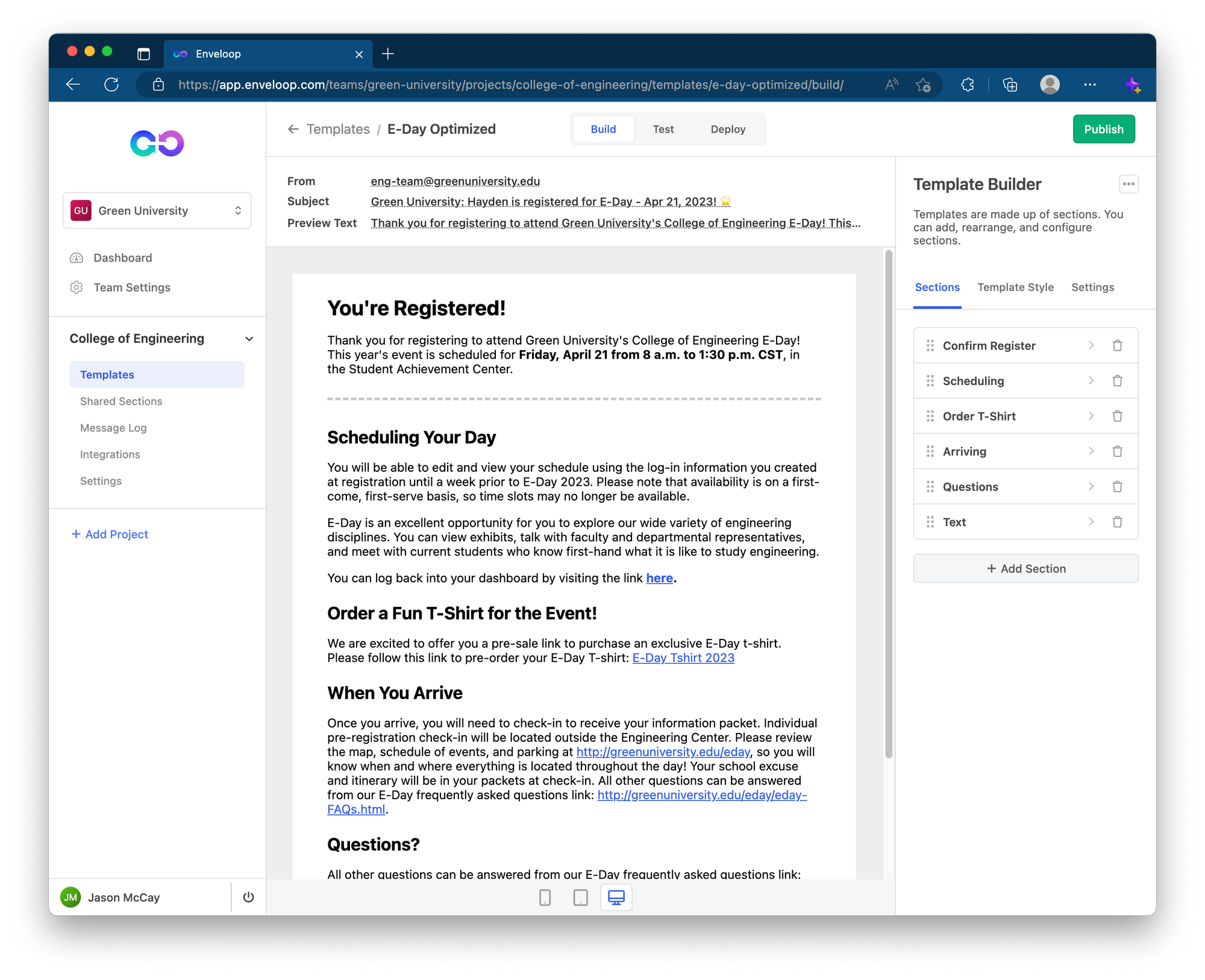
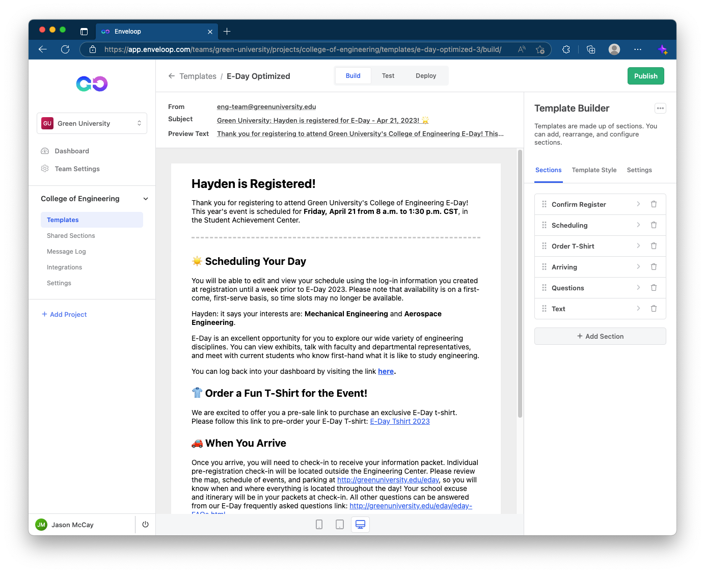
I've added the email to Enveloop and in a couple of minutes, I have added basic headers that label the chunks of information. Also, I bolded the date and time. I've told the user that they're registered, they'll need to schedule their day, and they can order a t-shirt.
More importantly, I reduced down the user's processing time from 60 seconds of annoyance to 1-2 seconds of rapid scanning. A 97% improvement. Nice! 💪
Tip #2: Make it Personal
The more customized and personal you can make communication, the more friendly it will be to the user. Enveloop makes it simple to add variables and inject personal touches that make the content more engaging.
In thsi example, we add in names and specific courses of study. We won't go into the details of how to add variables here, but you should definitely take a moment to check it how Enveloop lets you insert all sorts of dynamic content!
Tip #3: Use Emoji to Draw Attention to Important Info
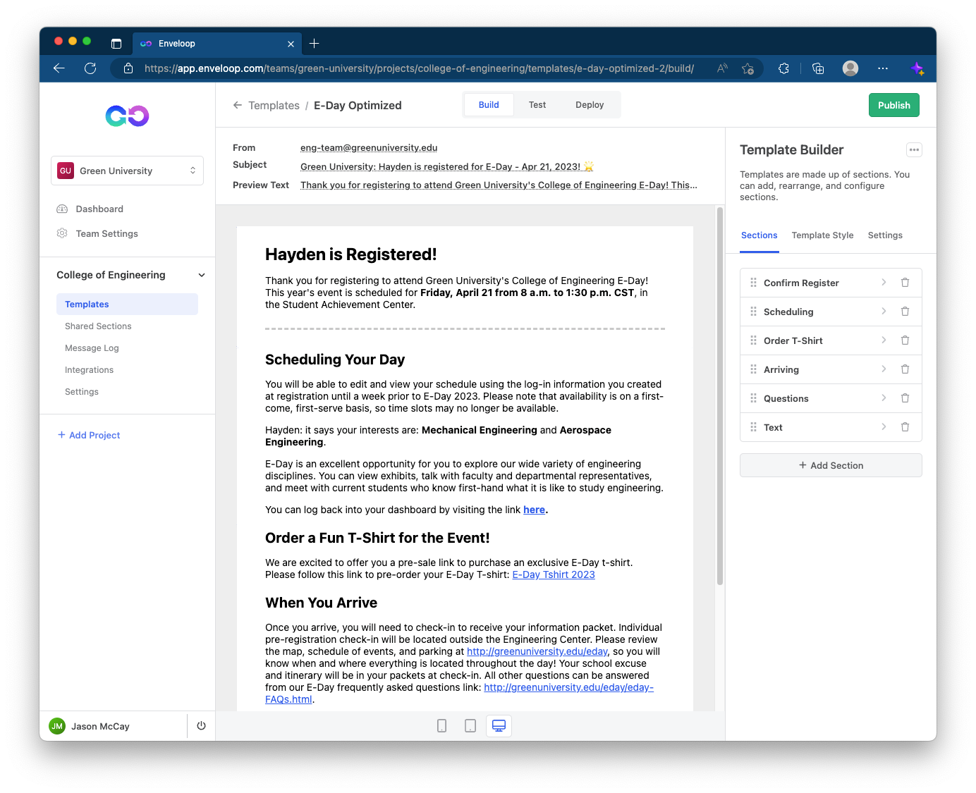
Emoji are fun and colorful, but they are also iconic and convey familiar patterns that assist users in defining and finding critical information. As always, don't overuse them, but don't be scared to use them either.
Tip #4: Priority of Information
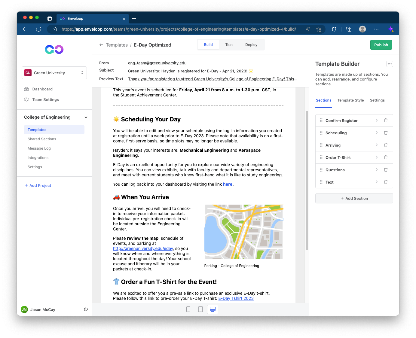
With informational / transactional messages, prioritizing your information from "most important" to "least important" is another way you value your user.
Imagine your user, frazzled and in a rush, calling back to an email you sent. In that moment, they are looking for key information to help them accomplish a task. Do the hard work for them and they'll succeed.
In this example, we make the decision that a campus map is more critical than ordering a shirt. Your priority may be different – be sure to think through how your end user will use this information.
Tip #5: Make Critical Contact Info Stand Out
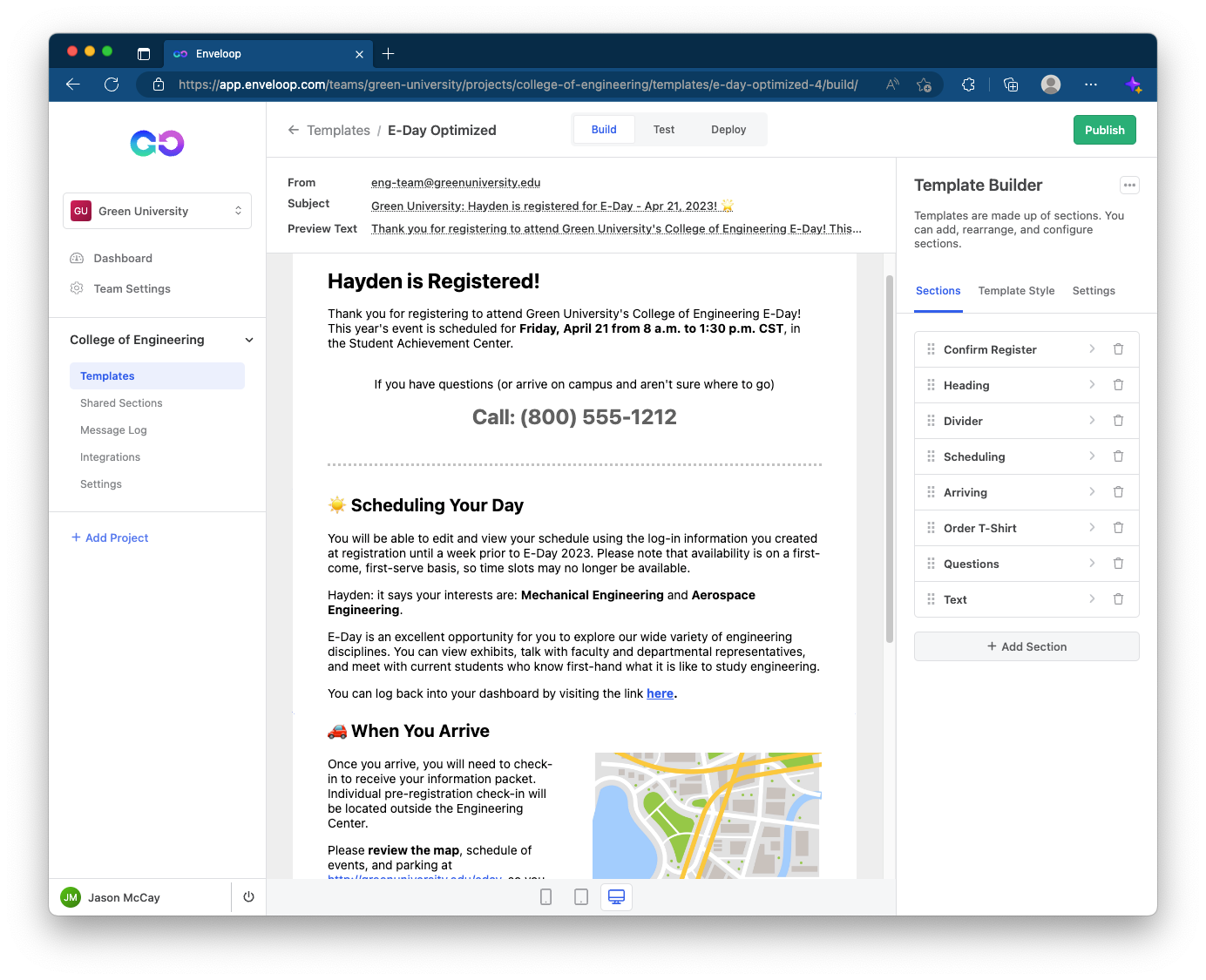
An addendum to prioritizing important information -- go a step further and ensure that your users are not having to scan and pull contact information out of large blobs of text.
Here, we add a section that includes a help-line telephone number. This points to the continued usefulness of transactional emails. Sure, a user won't need the phone number shortly after registering, but weeks later, when on campus, they can continue to use this communication for assistance.
Success!
There wasn't a focus on creating the best designed email message – we'll talk about how Enveloop can help with that in a future article. However, we accomplished something more important:
We demonstrated that in 4-5 minutes of effort, you can dramatically improve the usability of communication that you send from your application. With Enveloop providing a powerful template builder and a beautiful WYSIWYG experience, you can view, in real-time, what your user's email will look like.
Imagine trying to do this in your text editor with HTML/CSS. Painful.
In short: Value your user experience – even with your communication. Make them successful and you'll be successful!
Try Enveloop!
Enveloop is free to get started and you can build out and send you first template in under 5 minutes! Storing all your message code, design, and provider integrations in your app is an anti-pattern. Enveloop helps you send better messages and allows you to easily delegate messaging to others on your team!

